
Enhancing User Experience with Dark Mode
Dark mode has become a popular feature for websites, offering several benefits, particularly for users browsing in low-light environments. This design choice can improve user comfort, save energy, and provide a modern aesthetic. In this article, we’ll explore the advantages of dark mode and provide practical tips for implementing it on your website.
Benefits of Dark Mode

Reduced Eye Strain
Dark mode can help reduce eye strain, especially in low-light conditions. The high contrast between the background and text minimizes glare, making it easier for users to read content without discomfort. This is particularly beneficial for users who spend extended periods on your website.

Energy Efficiency
On devices with OLED or AMOLED screens, dark mode can save battery life. These screens illuminate individual pixels, meaning that darker colors require less power. Implementing dark mode can enhance the user experience for mobile visitors by extending their device’s battery life.

Aesthetic Appeal
Dark mode offers a sleek and modern look that many users find visually appealing. It provides an alternative to the traditional light mode, giving your website a contemporary edge. The dark color palette can also make other design elements, such as images and graphics, stand out more prominently.

Improved Accessibility
Dark mode can improve accessibility for users with visual impairments or sensitivities to bright light. By providing an alternative viewing option, you cater to a broader audience, ensuring that your website is usable and comfortable for everyone.
Implementing Dark Mode on Your Website
Adopting dark mode involves more than just inverting colors. To ensure a seamless user experience, follow these best practices.

Choose a Dark Color Palette
Selecting the right color palette is essential for a successful dark mode implementation. Instead of opting for pure black, which can create too stark a contrast and cause eye strain, use very dark shades of gray or navy. These colors provide a softer look that is easier on the eyes while still maintaining the dark aesthetic. It’s important to ensure that the colors you choose offer enough contrast to distinguish different elements clearly.
In addition to the primary background color, consider how other colors will appear against it. Elements such as buttons, links, and icons should have sufficient contrast to be easily identifiable. Using subtle gradients can also add depth and visual interest without overwhelming the user. Experiment with various color combinations to find a harmonious balance that enhances readability and visual appeal.

Ensure Text Readability
Text readability is a critical factor in dark mode design. Light-colored text, such as white or light gray, should be used to stand out against the dark background. It’s essential to test different font sizes and weights to ensure clarity. Small or thin fonts can become difficult to read, so consider using slightly larger font sizes and bolder weights for important text.
It’s also important to pay attention to line spacing and letter spacing, as these can affect readability in dark mode. Increasing line height slightly can improve readability by giving text more breathing room. Additionally, ensure that links and other interactive text elements are easily distinguishable by using color contrasts or underlines. By prioritizing text readability, you enhance the overall user experience and ensure that your content is accessible to all users.

Adjust Images and Graphics
Images and graphics can look drastically different in dark mode, so it’s crucial to optimize them accordingly. Some images may need a transparent background or a dark overlay to blend seamlessly into the dark design. Adding a subtle dark overlay can help images fit better within the overall aesthetic and prevent them from appearing too harsh or out of place.
Consider how graphics, such as icons and illustrations, will appear in dark mode. These elements should have enough contrast to stand out but not be so bright that they disrupt the overall design. Testing images in both light and dark modes is essential to ensure they look good in both settings. Additionally, using scalable vector graphics (SVGs) can help maintain image quality across different devices and resolutions.

Design Interactive Elements
Interactive elements like buttons, forms, and menus require careful consideration in dark mode. These elements should be easily identifiable and accessible, enhancing usability. Use light borders or highlights to make buttons stand out against the dark background. For forms, ensure that input fields are clearly defined and that placeholder text is readable.
Consider how hover effects and other interactions will appear in dark mode. Subtle animations and transitions can enhance the user experience, making interactive elements feel more responsive and engaging. Consistency is key; ensure that all interactive elements follow a cohesive design pattern that aligns with the dark mode aesthetic. By focusing on the usability of interactive elements, you create a more intuitive and user-friendly interface.

Implement Animation and Transitions
Smooth transitions and animations can significantly enhance the dark mode experience. When switching between light and dark modes, ensure that the transition is seamless and does not disrupt the user experience. Subtle animations can make the switch feel more natural and engaging, providing a polished look to your website.
Consider using animations to highlight interactive elements or to guide users through different parts of your site. For example, a gentle fade-in effect for pop-up notifications can make them less jarring. However, it’s important to strike a balance; animations should enhance the user experience without overwhelming or distracting users. Testing different animations and gathering user feedback can help you find the right approach that complements your dark mode design.

Offer User Preferences
Allowing users to toggle between light and dark modes based on their preferences is a key feature for enhancing user satisfaction. This flexibility accommodates different environmental conditions and personal preferences, ensuring that users can choose the mode that best suits their needs. Implementing a simple switch or button for toggling modes should be straightforward and easy to find.
To further enhance user experience, consider saving user preferences so that their chosen mode is remembered on subsequent visits. This can be achieved using cookies or local storage. Additionally, you can provide an option for users to follow their device’s system preferences, automatically switching modes based on the user’s operating system settings. By offering customizable options, you cater to a wider range of user needs and preferences.
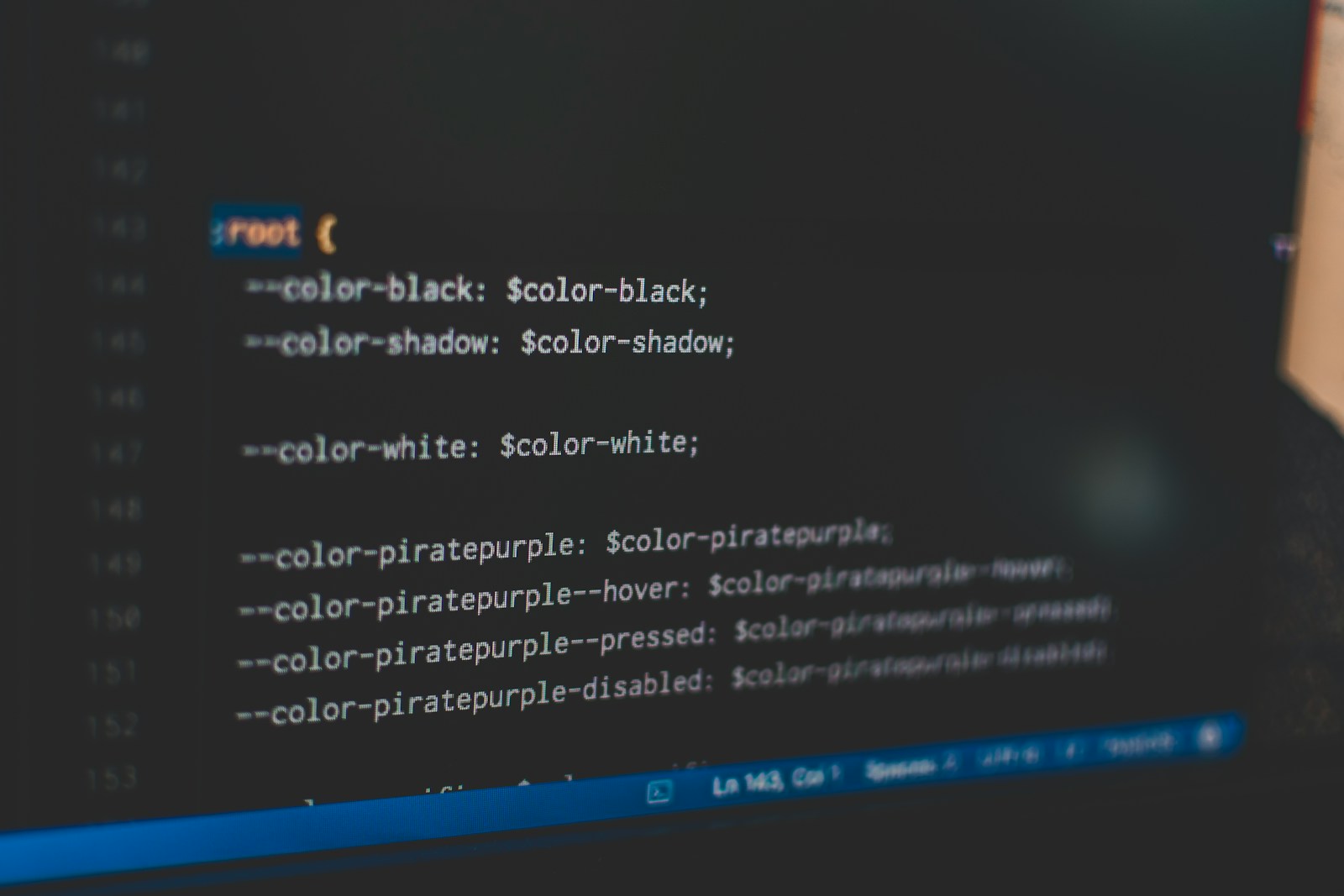
Use CSS Variables for Easy Switching
Using CSS variables to manage color schemes for both light and dark modes simplifies the process of switching between modes and ensures consistency across your website. Define color variables in your CSS, and use these variables throughout your stylesheet. This approach allows you to update the color scheme quickly without extensive code changes.
For example, you can define variables for primary and secondary colors, background colors, and text colors. When switching to dark mode, you only need to change the values of these variables. This method not only streamlines the development process but also ensures that all elements on your site adhere to the same color scheme, creating a cohesive and polished look.

Ensure Browser and Device Compatibility
Testing your dark mode implementation across different browsers and devices is crucial for ensuring a smooth user experience. Compatibility issues can arise due to variations in how different browsers and devices handle CSS and JavaScript. Conduct thorough testing to identify any inconsistencies and address them promptly.
Use browser developer tools to simulate different devices and screen sizes, ensuring that your dark mode design looks good and functions correctly on all platforms. Additionally, consider user feedback to identify any issues that might not be apparent during testing. Continuous testing and iteration will help you refine your dark mode implementation, ensuring a seamless experience for all users.
Examples of Effective Minimalist Design

X
X’s dark mode provides a sleek and modern user interface that enhances readability and reduces eye strain. The use of dark gray backgrounds with light text creates a comfortable browsing experience.
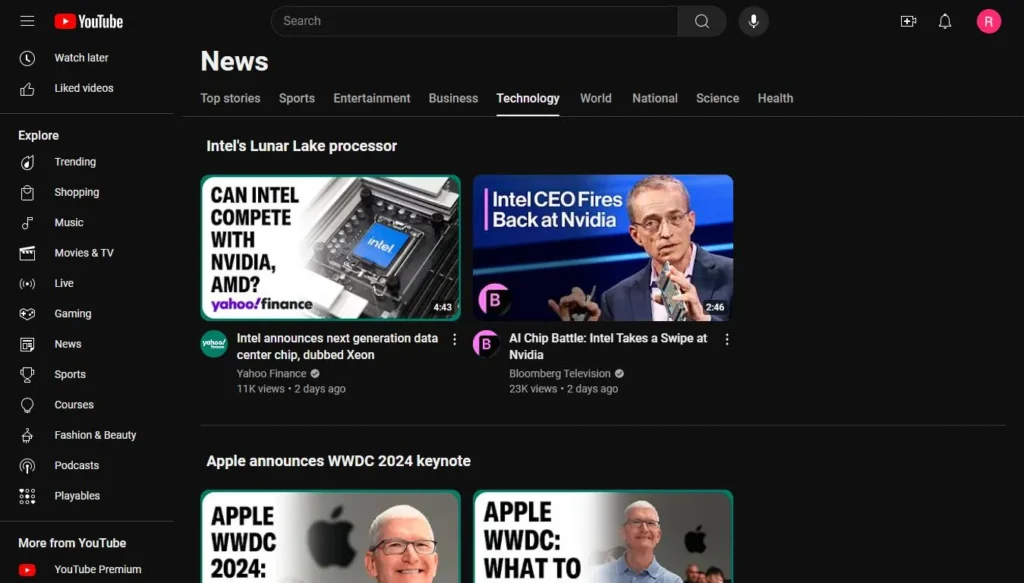
YouTube
YouTube’s dark mode offers a visually appealing alternative to its standard light mode. The dark background makes video thumbnails and content stand out, improving user engagement.
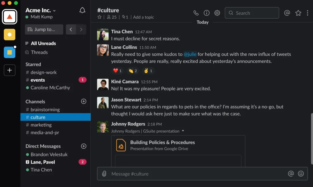
Slack
Slack’s dark mode is designed with user comfort in mind. The dark color palette is easy on the eyes, especially during long periods of use, and maintains clear visual hierarchy.
Dark mode can improve user experience by reducing eye strain, saving energy, and providing a modern aesthetic. By thoughtfully implementing dark mode on your website, you can offer users a more comfortable and visually appealing browsing experience, especially in low-light environments.
As you consider incorporating dark mode, remember to focus on readability, visual hierarchy, and compatibility. With careful planning and continuous improvement, dark mode can become a valuable addition to your website’s design, catering to a wider range of user preferences and needs.