
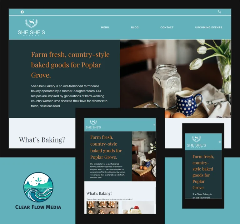
She She’s Bakery is run by a mother-daughter team in Poplar Grove, IL. They deliver farm-fresh baked goods at their farm or local markets, and wanted to give their loyal customers a website to order ahead.
Because of their unique and diverse offerings, including health-conscious and allergy friendly baked goods, She She’s Bakery often sold out of desired products early in events. To mitigate the inventory problem, they would take orders via phone. Phone orders, however, can be inconvenient for customers’ schedules.
Clear Flow Media built a custom website to alleviate these concerns. With their new online presence, She She’s Bakery can easily list products that are available for direct purchase or pre-order; list upcoming events; accept orders and payments online; and give customers specific options for pick-up.
Components
She She’s Bakery required 3 primary components.
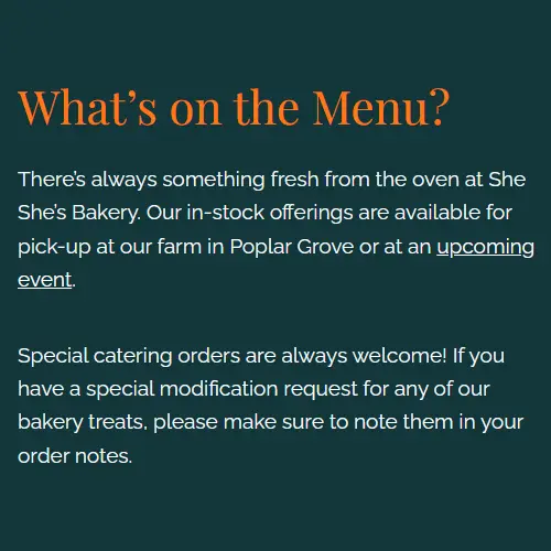
Menu
The Menu is the primary focus of the website. This is where She She’s can list items that are in stock or available for special order. Customers can easily see what’s “on the menu” by visiting this page ahead of events.
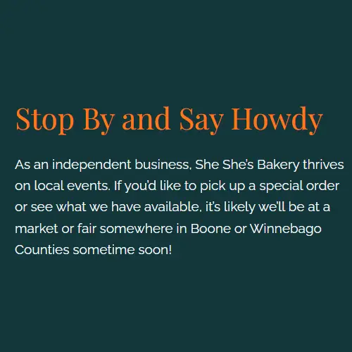
Events
As She She’s primarily interacts with customers at local markets, an Events calendar was a necessity for their website. They can easily list all upcoming events, including hours and locations, so customers can quickly see where to find them next.
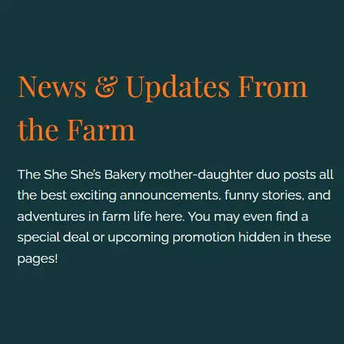
Blog
She She’s previously shared all news and updates via Facebook posts. A blog provided a way to publicize long form updates, product deep-dives, and other detailed information that’s relevant to their customers.
Customizations
All out-of-the-box solutions utilized were customized for She She’s Bakery’s use case. These customizations included removing unnecessary options from WooCommerce, adjusting the default Events Calendar template, and creating a fully customized child theme.
By removing functionality that is not relevant to their local bakery, She She’s will have a more streamlined experience updating their menu, events, and blog moving forward.
Design
She She’s Bakery has a beautiful, minimalistic logo that includes white text on a teal background. Their website was designed to be an extension of the modern farm feel. Spacious content areas and splashes of complementary colors were used to create a user-friendly website to invite browsing the menu.
Because the contrast ratio between teal and white is low (below 3), larger typography was utilized to maximize accessibility. Additional visual elements, including subtle animations and black text, were added to high-touch areas to improve readability on small screens.